Are these common brochure design mistakes hindering the effectiveness of your marketing? This article provides straight-forward, simple to implement advice that can make the difference between connecting with your reader or turning them away.
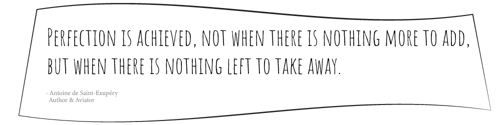
The design should present your information in a clear, concise format that is easy to read and follow. Choose the content based on what will provide the most value to your reader. Delete anything that is not essential. Cramming in too much information can be just as ineffective as providing too little. When you’re tempted to fill up every inch of available space, stop right there and refer to these words from the author who wrote what just might have been one of your favorite childhood books – The Little Prince. “Perfection is achieved, not when there is nothing more to add, but when there is nothing left to take away.”
Keep that in mind as you create your brochure. Use it as a bit of inspiration if you’re struggling to decide which content to keep and which needs to go. This is a challenge all designers face regardless of their years of experience. It can be especially difficult for those closest to the content – if you are the owner of the business, for example. In this case you may find it beneficial to ask someone else for an objective opinion of what content they feel is most relevant and helpful.
Now that you have a good idea what you are going to include in your brochure, help it shine through and attract the attention of your readers with these design tips and best practices. Below we cover some of the most common brochure design mistakes we see, along with tips for correcting them.
The Overuse of Exclamation Points!!
Simply adding an exclamation point at the end of a sentence isn’t going to make your reader any more enthusiastic about it. Don’t depend on a punctuation mark to take the place of good persuasive writing.
Why this is bad: An exclamation point can too easily erode credibility of your message. It can come across as unprofessional. It makes people cringe. Or worse, automatically distrust you. Or in the words of F. Scott Fitzgerald, “Cut out all these exclamation points – it’s like laughing at your own jokes.”
How can you fix it? Work on crafting your writing – including your tone and your choice of words, to compose a compelling, well thought-out marketing message. This will naturally engage and interest your readers much more than a punctuation mark will.
Excessive Use of Font Styles
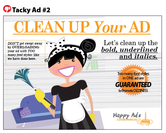
The style of a font is basically just a variation of a font – such as the the bold or italicized versions. When used effectively, a style change (such as setting subheads in bold) can increase readability, add emphasis or increase visual impact. When overused, it has the opposite effect.
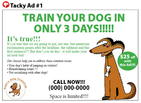
Why this is bad: The purpose of using a different font style for particular selections of your text is to help them stand out or to distinguish one section of your document from another. However, when there’s too much font styling going on, such as when entire blocks of text are set in all caps or bold, there isn’t much left to stand out – because everything is standing out. It also looks sloppy and way too busy, such as the ad above (note all the caps, bolding, underlining, italics plus underlining!), which distracts from the message and hinders its’ effectiveness.
How can you fix it? Reserve the bold, italics, all caps, underlining, and the like, for places where they will add clarity or help guide the reader through different sections of a document. Resist the urge to apply multiple styles to the same word. If you’ve set your subheadings in bold, for example, there is no need to apply italics as well. Likewise, for something styled in all caps, it doesn’t need underlining too.
Using too Many Different Typefaces
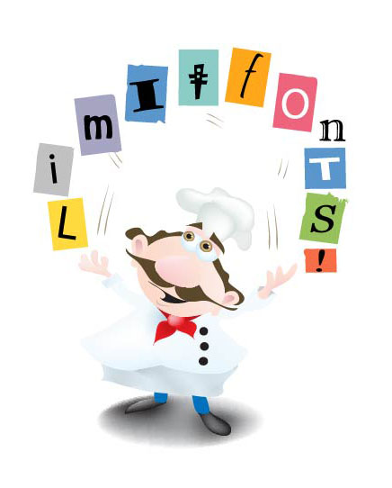
This is similar to the above mention of using font styles, but this time we’re referring to different typefaces – not just different styles. Generally speaking, your brochure should stick to two different typefaces – One for the headline and another for body copy.
Why this is bad: Too many cooks spoil the broth. Likewise, too many typefaces spoil the brochure. Typefaces have their own unique personality and tone so when too many are combined in one document it’s difficult to maintain cohesiveness.
How can you fix it? If you see you’ve ended up using something like Times New Roman, Helvetica, Arial, Goudy, and Comic Sans in the same document, it’s time to pick your favorite, and say good bye to the other ones.
Using an image you saved off the web
It’s no secret that it’s technically possible to right-click and save an image you’ve come across on the web. But this is a big, big no no.
Why this is bad: Firstly, remember the chances are that the image you’re trying to save from the web belongs to someone else and you are not legally allowed to use it. (Even those found by using the google image search, which many incorrectly think of as “free clip art”).
Secondly, the resolution for images on the web is 72 dpi (dots per inch), far below the 300dpi needed to reproduce a quality image for print.
How can you fix it? There are many online stock photography sites where you can find inexpensive images for use in your print projects or your digital advertising such as your website, blog, and social media posts. There’s also plenty of free sites that offer photos at no charge. Try Canva or StockSnap for a variety of stock photos that are free to download. For all you cooks, chefs and food bloggers, you’ll find beautiful images of food and recipes to make your Instagram or blog posts deliciously stand out, at Foodiesfeed.
Not utilizing white space
White space is an area in your brochure or postcard that does not contain any text or images. It is the blank, empty space. And it’s a good thing in the design world. Many people feel the need to use every tiny bit of space for their message and consider the space wasted if they don’t. This is the equivalent of clutter. Too many knick-knacks on the bookshelf. So much stuff in the junk drawer that it’s difficult to open. Clear it out, breath easy and think of white space as a “resting” place” for the minds and eyes of your readers.
Why this is bad: A cluttered brochure is overwhelming, confusing to follow and annoying for the reader. It’s like opening the door to your teenager’s bedroom and seeing every inch of the floor covered with clothes, shoes, old pizza boxes and discarded dirty food containers. It’s frustrating, not very inviting and definitely not a pleasant place to be. Your instinct is to close the door and walk away – ditto for a brochure that’s filled to the brim.
How can you fix it? Decide on and keep only the most important content. Keep it concise and clear to hold the attention of your readers. It can be difficult to decide what makes the cut, especially if you are creating a brochure for your own business. However, keep persevering because you’ll find a wonderful, powerful hidden benefit behind this strategy! Because this exercise forces you to keep only the most important content, it will naturally lead you to discover your unique selling point (USP). Your USP is what makes your business unique from your competitors. The reason someone should choose your company over another.
Try the graphic design tips and best practices above to increase the effectiveness of your marketing materials. If you still can’t get it the way you want it, get in touch with us and we’ll create one for you that will capture the attention of your audience and free up your time.